Current Size: 100%


National Cancer Registry publishes on-line maps of cancer rates by county up to 2012
Today the National Cancer Registry published new on-line maps which show annual average cancer rates, at county level for various cancers, from 1994-2012.
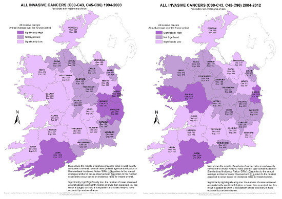
These maps show cancer rates in each county in Ireland compared to overall expected national rates with significance illustrated by colour coding.
Three maps are available for each of 20 cancer sites; these show overall cancer rates for each site over the 19-year period for which data is available (1994-2012) as well as over two timeframes from (1994-2003) and (2004-2012). At a glance these maps indicate whether or not a particular type of cancer is significantly high or low for each county.
For more detailed analysis by geographical area, please see the Registry’s All-Ireland Cancer Atlas which depicts various cancer sites at electoral division level. The All-Ireland Cancer Atlas shows smoothed incidence data across the whole island to look for overall geographical patterns in cancer relative risk.
on Wed, 04/02/2015 - 10:26 by mocallaghan